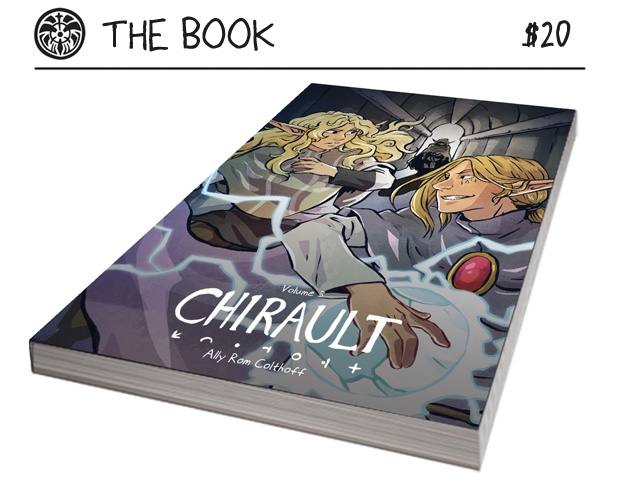
Guest Post: Ally Rom Colthoff of Chirault and Prepping for Print
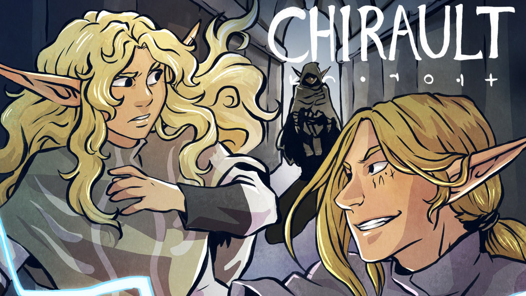
Hello! My name is Ally Rom Colthoff and for the last 10
years I’ve been working on a webcomic called Chirault-- a high fantasy
adventure story with lots of magic and monster battles. I’m currently in the
process of bringing the third collected volume of the story in the print
(there’s a Kickstarter running here for anyone interested), and it’s been an
interesting path making sure the pages are ready.
At the time I started, I had no notion of eventually
printing it; the story was meant to be a fast practice run for ‘something
bigger’ (lol), but it quickly took on a life of its own as I became attached to
the characters and world. Seven years after first launching it, after some
interest from my readers and the arrival of Kickstarter as a fundraising tool,
I decided to try taking it to print… but those early pages desperately needed
to be updated.
(for several reasons)
There are four major issues that tend to hit webcomic
artists bringing their work to print; this article will cover the ones that
affected me in particular, and how I dealt with them.
◾Page layout
◾Lettering
◾Colour conversion
◾Resolution
I will disclaim that for the processes I outline below, I
use Adobe Photoshop CS5. The steps may be replicable in other software such as
Clip Studio, but for this article I’ll be sticking to my own approach, which is
admittedly idiosyncratic. This article is also dealing with how to retro-fit an
existing body of work for print, rather than how to make it compatible from the
outset-- really, on my next project I’m going to do my best to make sure I
compensate for these things BEFORE I start work on my pages, which will save me
a lot of work going forward. There are almost certainly more efficient ways to
streamline the process that I haven’t discovered yet, so I welcome input on it!
I hope that by writing about the issues I faced, I can help others who may end
up dealing with similar ones.
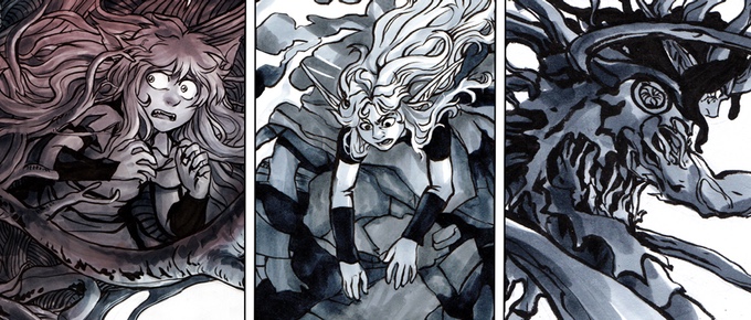
My comic is monochromatic and mostly neutral earth-tones,
which are easy to convert, so that wasn’t an aspect that gave me trouble. The
conversion process is a concern for most digital artists, so I’ll link to a
couple of articles: here’s one by Print Ninja outlining the basics
of colour conversion and giving some tips, and here’s
another by Christianne Goudreau with some more advanced advice on
optimizing digital artwork for print.
I also managed to dodge problems with resolution (that is,
the pixels per inch and size of the files), in large part because as my comic
is illustrated traditionally and then scanned in; my pages were already at
300DPI. Saving pages at low-res is an unfortunately common issue for a lot of
digital web-cartoonists working on their first comic; for this reason, even for
artists who have no intention of bringing their story to print, I strongly
encourage everyone to draw their pages at 300DPI. If you change your mind
later, you won’t want to yell at your past self!
...Well, that’s a lie, I still wanted to yell at my past
self sometimes too for the potholes I DID step into. Here’s what I faced:
LAYOUT

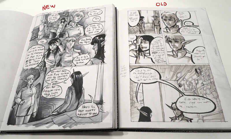
photo of open sketchbook with bleed
page, beside a PS screencap with guides
I made a very basic error when drawing my early pages: I
didn’t keep my page margins (the amount of white space between the edge of my
panels and the edge of the page) consistent from page to page. Not only that,
but the shape the panels took up slowly morphed over time; initially I had wide
white margins on both sides, but as I drew them in an 8x11 sketchbook the panel
borders slowly expanded until by page 400 I was using more horizontal space.
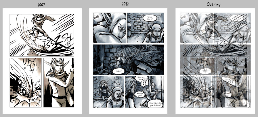
two pages side by side, and then
overlaid at 50% opacity
I did not want to redraw all of the pages (as there are over
1000 pages total in the story that would be a monumental task), but I did have
to find a way to balance the pages so that they were consistent. So the first
step was to choose the dimensions that the physical book would be printed at.
I ended up going with 6”x8”; a nonstandard (but roughly
manga-sized) book that could accommodate both my narrowest and my widest pages
without looking too unbalanced. With that in mind, knowing the exact pixel
dimensions my files needed to be saved at (2550x3500 pixels, to be precise), I
created an Action in Photoshop so that I could reproduce
the same steps on every single page.
Here are the steps in my Action:

◾Converting the file to CMYK. As my colours are very neutral
and monochromatic, and my scans are a single layer, this was generally the only
colour-related step I needed to take. For digitally-coloured artwork, it’s a
good idea to flatten the layers before converting-- CMYK will change the way
layer blend modes work, particularly Multiply and Overlay layers.
◾Set Background Colour. In this case, it was making sure my
background colour was set to white.
◾Canvas Size. I didn’t use Image Size because that will
resize the entire image (possibly distorting it vertically or horizontally if
the aspect ratio was not already the same as the new dimensions); instead I
used Canvas Size, which will extend the edges of the page or crop into it in
the event that the new size is smaller. In every case I was adding to the
pages, because I hadn’t accounted for Bleed in my working files-- more on that
later. The Photoshop Action will remember the exact numbers you plug into the
dialogue box, so they’ll all be the same.
◾Make. The 4 ‘Make’ commands refer to creating guides (the
blue lines visible in the screencap below)-- these help me make sure my panels
are staying a consistent distance from the edge of the page. The area within
the guides is known as the Safe Zone-- most comic page printing templates will
include some notation on this, and Making Comics has a breakdown of it here.
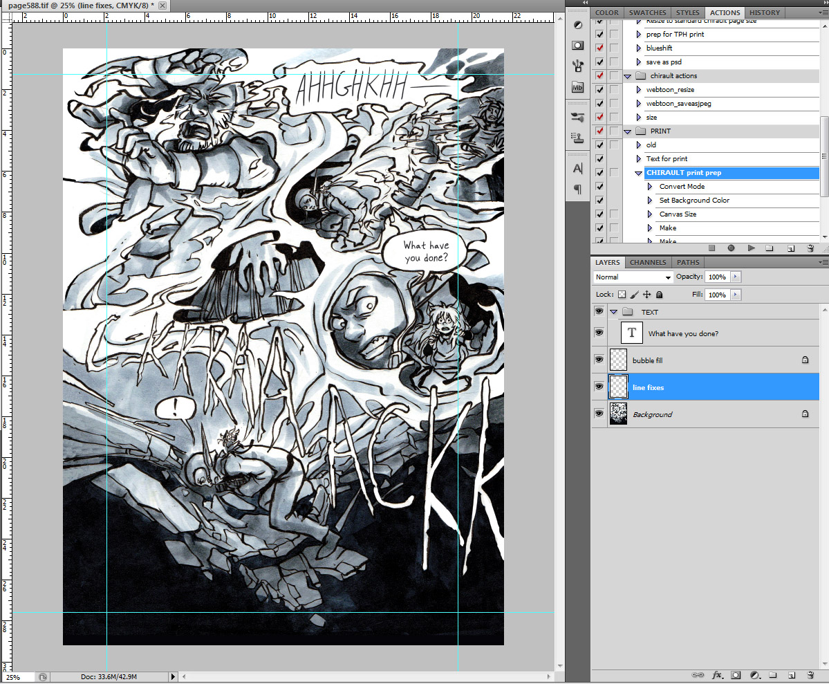
screencap of page with guides
With all of these steps done, I can start to identify
problem cases. Pages whose panels extend too far outside of the guides may need
to be shrunk slightly; pages whose panels are too far inside may need to be
expanded so that the margins aren’t noticeably different if two such cases were
to be laid side by side.
This is also where I can address bleed. That’s the term for
the buffer of space allotted to the very edge of the page, outside of the trim
line (where the page will be cut, the final size of the book). Whenever there’s
artwork that expands all the way to the very edge of the page it’s important to
add about 1/8th of an inch (0.125”) to the edges of the page and continue the
artwork into this zone. This is because of the way books are created: the art
is printed, and then cut down to size, and then assembled. If the artwork ends
at the point that the page is cut, the machinery may leave a thin white line at
the very edge of the page, which will not look very good.
For pages where all the panels are nearly contained and the
margins are all left empty, Bleed isn’t a worry; however, I did have a number
of sequences with art extending to the edge of the page, and I had to address
it there.
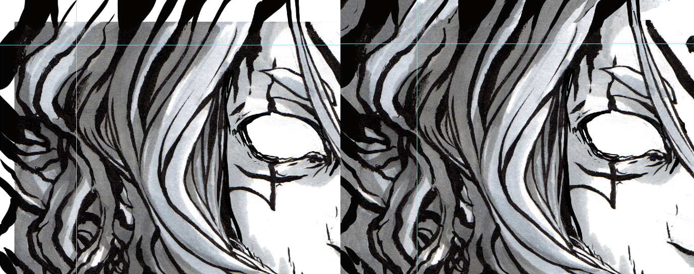
[insert picture 008]- a shot of that one page with the
branches in v3 (yes that one)-- showing white edges
My strategy, after the page had been resized with bleed
added, was to use the regular brush tool to supplement the lineart or any
structure that was needed, and then to fill in the rest with the Clone Brush.
Because the art is all traditional, matching the texture and tonality was very
important-- so I’d use the Clone Brush on a section close to the blank space
and try to match it as seamlessly as possible, to give the impression that it
was a continuation of the same art.
Where there was detailed lineart, I created a layer over top
and sketched in the extensions of the lineart, as it’s very finnicky trying to
continue precise angles or curves with the Clone Brush.
closeup of one of the edges, screencap
including the layer structure
It’s a time-consuming and finnicky process to repeat these
steps for every page that needs it, but it pays off once the book is in print;
inconsistent formatting can be distracting.
LETTERING
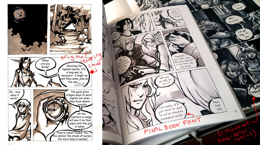
When I started my comic, I didn’t know very much about
lettering, and I used Comic Sans for all of the text. A year or two later, I
started hanging out more with other webcomic artists, and learned that Comic
Sans is terrible, so I found another font and switched to it. Then, I found out
how to make a font of my own handwriting, and started using that. And THEN I
decided (I thought it was faster, or something) to try to actually really
hand-letter right on the page itself-- after 100 pages or so, with decreasing
legibility, I switched back to the font based on my handwriting, and that is
what stuck.
I wanted the print volume to be as consistent as possible,
so of course addressing the inconsistent lettering was one of my first
priorities when I started work on Volume 1. I had saved all my original files
as flattened JPEGs (do not do this), so updating the lettering required me to
access every single page, erase the text, and re-type it in full with the new
font. To ensure it was a consistent size across every page, it was important to
do this AFTER I had done all the layout steps above, so that the text wouldn’t
be scaled in any way.
I had an additional concern with the text: because I had
chosen to print with a 4-colour (offset) process instead of a digital process (here is an article explaining the differences
between them), I had to ensure that the black colour of my type was True Black
rather than Rich Black. This means, if you pull up the colour swatch in the
Colour Picker, the CMYK value will be expressed as 0, 0, 0, 100. In other
words, it only uses black ink, rather than being built up from all 4 inks.
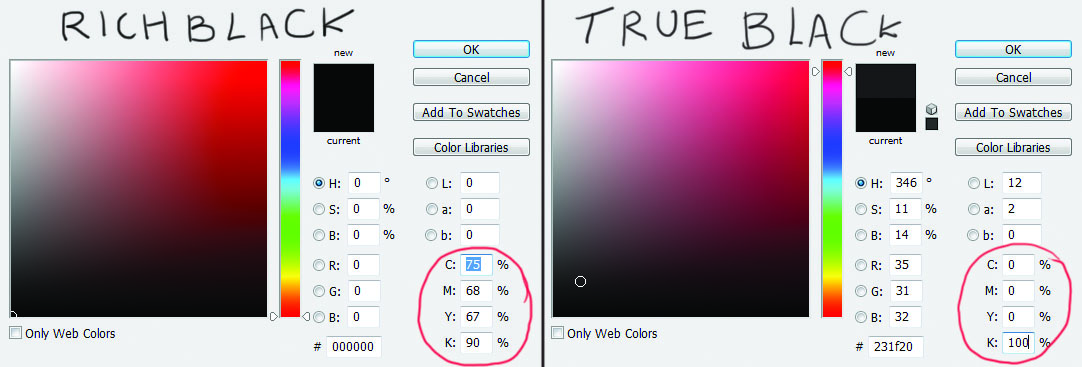
On the screen true black tends to look a little greyish and
can have a reddish tint, but it will print using black ink in the 4-colour
process, and so will come out fine on the page. I should note that for people
who intend to use a digital printer this step is less important-- thanks to the
way the equipment works, the issues that using true black is intended to
prevent (notably, a ‘halo’ or fog of ink around text or fine lineart) don’t
tend to appear in digital prints. Most artists doing a short run of books (less
than 500 copies) will be using a Print-On-Demand service, and those tend to be
digital only.
There are other steps to take in printing a book-- using
InDesign for layout, adding page numbering, or design basics like creating a
cover. But I wanted to cover these two parts of the process, as I haven’t seen
many other tutorials talking about these steps.
That’s all for now, thanks for your time! If you’re
interested in checking out my books, Chirault’s Volume 3 Kickstarter is live until the 24th of
May, and you can buy one or two or all three of the books, as well as a short
full-colour minicomic set in the same universe.
Comments
Post a Comment