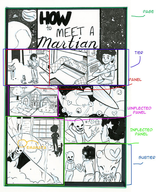
Guest Post: Kabocha and Comic Process-Linked: Intro to Comic Craft
Drawing a comic is a lot of work. It’s a process involving a lot of repetition, learning, and frustration at times.
I’ve been working on webcomics for over 12 years now, having started when I was a wee little highschool student with access to a website of my own. I’ve also got a fair amount of experience with webhosting and such, which I may write about later on down the line.
Currently, I am working on a comic called Linked, which I’ve been posting online for going on a year now. I’ve been working on this story for quite a fair bit longer, though, having gone through several iterations of the characters and plot.
My process over the years has changed immensely. When I first started drawing comics, I was working entirely in Photoshop 7. I had no idea about resolution, page setup, or anything. And thus, my final product looked something like… Well… This:

I didn’t even sketch before drawing pages! Man, was the eraser tool my BFF…
My process at that point in time was: “Oh, hey, this is the next logical page isn’t it?” I’d just draw, without any real thought as to what I was doing. I’d just draw, throw on some low-resolution screentone (courtesy of Jen, who still has the :::Screentones::: site up), and put some text in there.
...
Fast forward about 12 years, and several changes of application and process later…

Each of these programs has their own strengths, and your process will vary for each!
Nowadays, I’m working mostly in Clip Studio Paint.
When I start a chapter, I usually take some time to actually plot things out on paper with a few doodles of key scenes, and decide what I want to hint at for later down the road. This usually works pretty well for me, although I do find myself sometimes needing to edit my own work.
I already have some preset settings for my page templates for single pages - I work at 300DPI, with a trimmed page size of 8.5 x 11. I designed my page specs based on information several printers had online regarding bleeds and margins, as well as my own preferences. While I don’t really intend to go to print, this is not a bad thing to keep in mind.
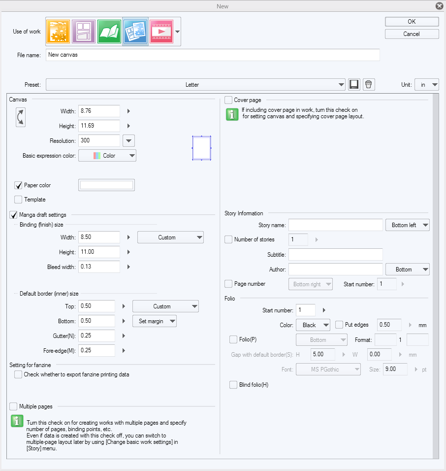
Here’s my page margins, bleeds, borders, etc. You’re welcome.
Once I have a new page set up, I then start on sketching things out based on my script. I don’t presently do thumbnails, which could be a hinderance to me, but for the moment I’m getting along fairly well. That could change down the line, of course.
Sketching is also the slowest part of my process, because it requires the most mental legwork for some reason.
The process may also involve several hours of thinking about “What the heck am I going to do,” interspersed with putzing around on Youtube, DeviantArt and drawing things that are decidedly not comics.
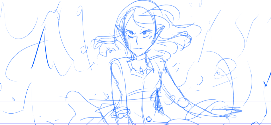
Often, I’ll work on by sketching out three or four pages at a shot, and then inking and toning through them one at a time. These don’t necessarily correspond to an entire scene - it’s just faster for me and less pressure to get a few pages sketched and work through those.
Once I do get a page or three sketched, they usually end up looking something like what’s below. My sketches are generally done in a bright blue, indigo, or purple, for no reason other than it’s easier to ink over for me. ...And when you draw on the wrong layer, it really becomes apparent.
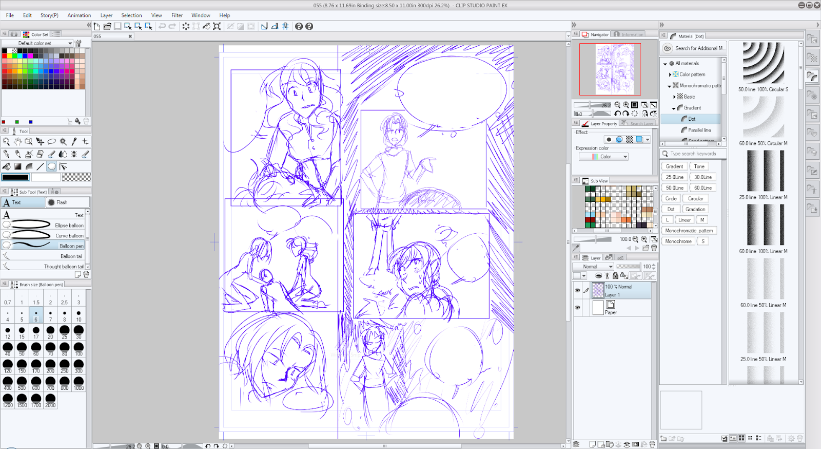
Because I had JUST finished page 54, the text panel is the last thing I had open when I fired up Clip Studio, so don’t mind that.
Once I have my sketch loaded, I lower the opacity to somewhere around 20%, sometimes lower, and start using the Frame Border tool to create my panels.
Clip Studio’s Frame Border tool is actually quite unique in that it creates masked layer groups for each panel, which saves a little work for something I would have already done for lineart and some things. On the downside, my CSP files are a lot larger than my PSDs used to be because I tone in each panel, rather than doing it for the entire file at once.
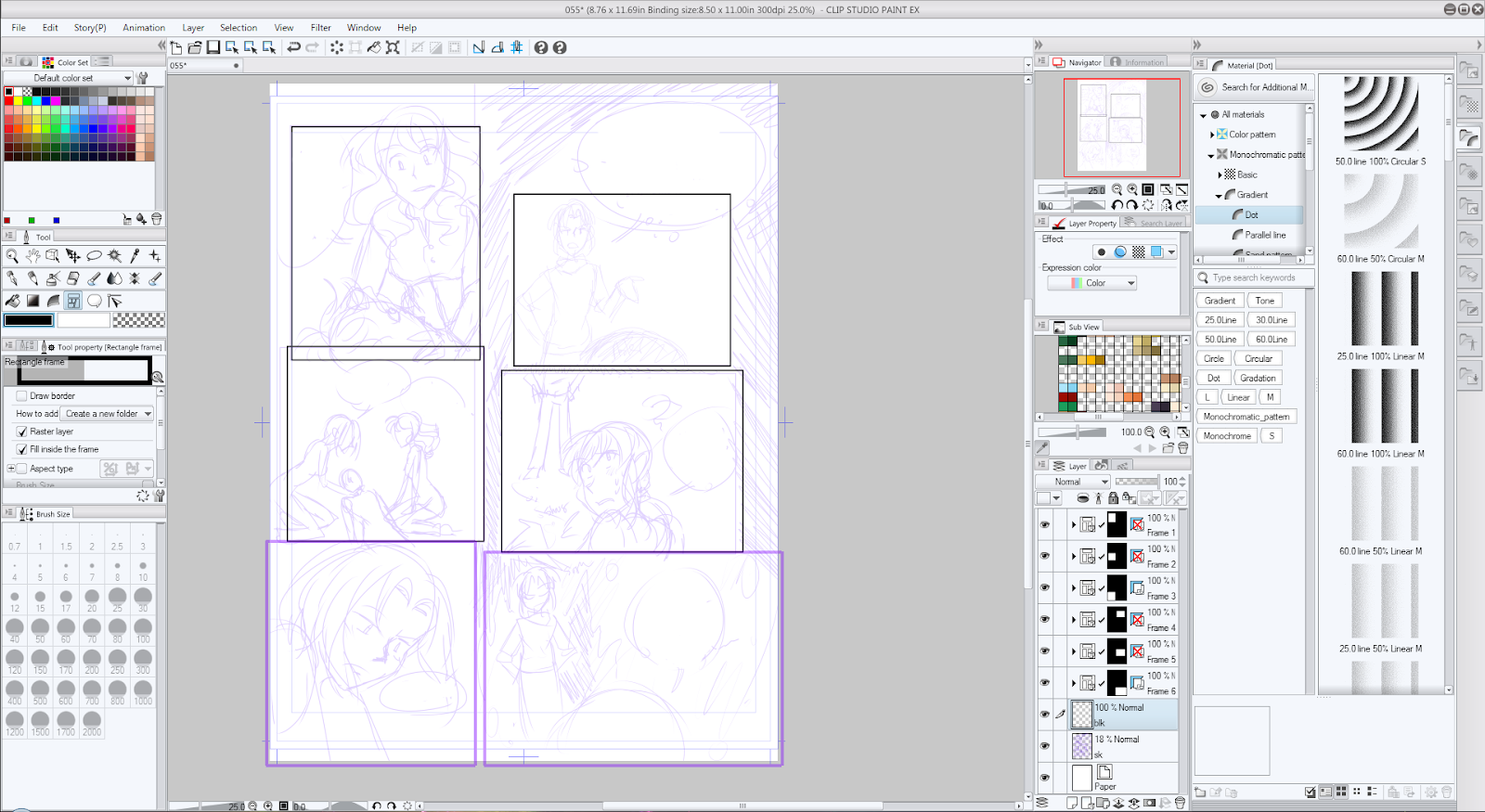
Yes, there’s overlap. This isn’t a big problem. You can hide layer groups and such, and each group has its own background layer to them.
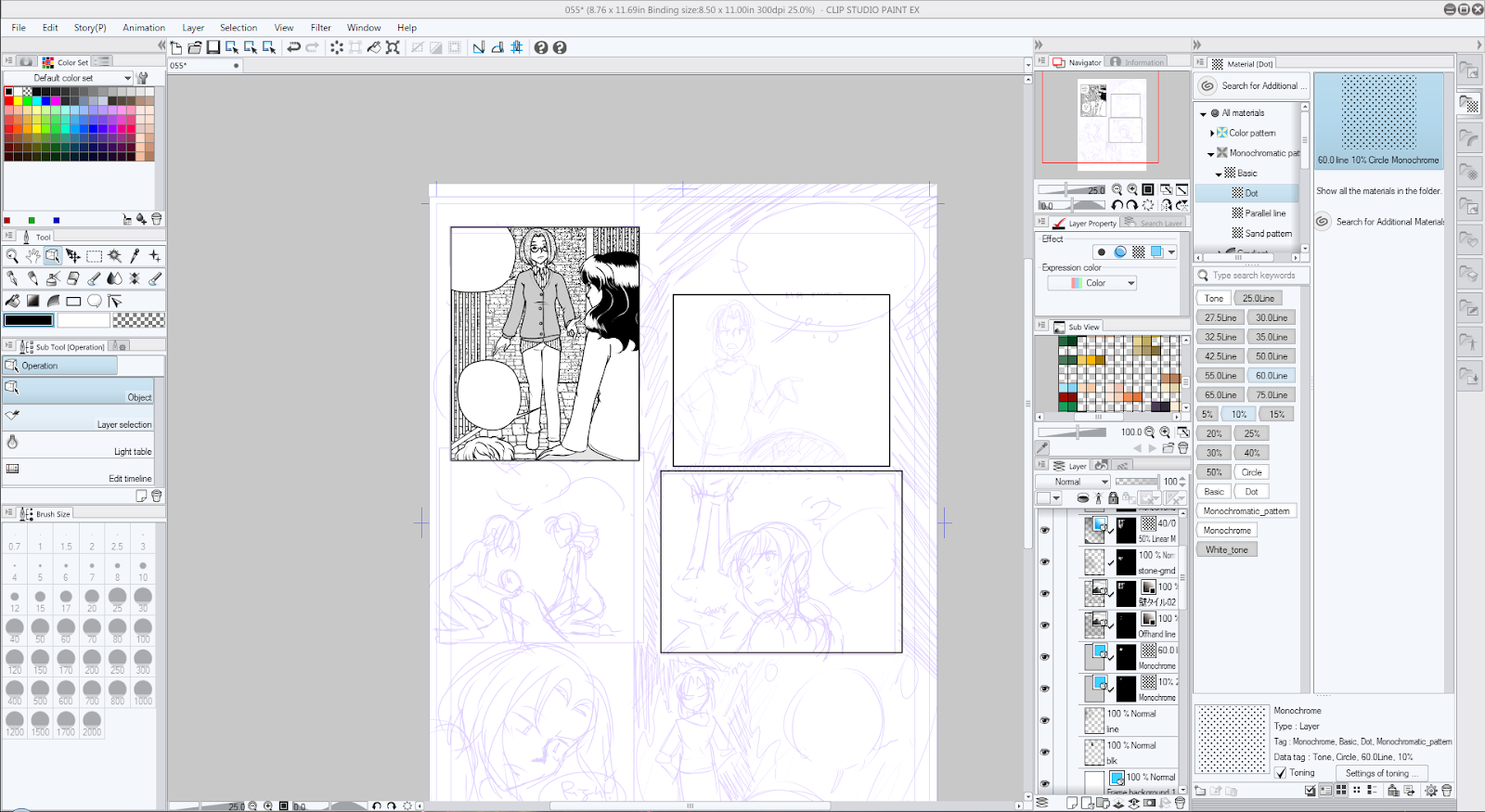
And now we get to working on a singular panel. Zoom in, select the layer group, and start working!

Sometimes, as I ink, I change poses and such as I go. ...I don’t recommend doing this too frequently, as this could lead to some incongruities.
After I ink, I move on to black fills and toning. Usually black fills are done for hair, following this process I came up with (though I don’t always use tone).
When I lay out my text, I usually type first, then draw the text bubble to fit around the text. ...I just omitted the text here for some reason.
But in any case, I’ve at least finished a panel… And now to repeat the process for the remainder of the page.
From page to page, I do sometimes need to make little visual cues to myself beyond sketching figures.


Usually, loose swirls, bubbles, and such indicate some form of magic in use - although it’s not necessarily clear to someone else reading my pages. These kinds of cues have become important for me to use, because they help remind myself what a panel should eventually look like.
When drawing these effects, the final implementation comes down to the tools I have on hand, but has so far largely remained consistent.
This is something I’ve done since… Well, almost the entire time I’ve worked on the comic:
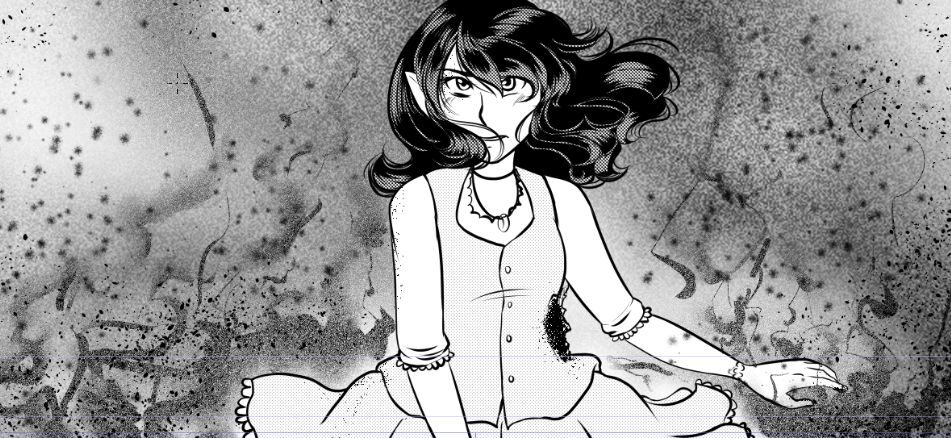
Page 17 - I actually kinda like the sketch better, though
And after all that inking, futzing around, and hard work, we have a finished page. I’d had a somewhat different version of it but ended up going back about two weeks after completion and revising it somewhat, based on some feedback I got from one of my beta readers.

The process isn't over just because I finished drawing the page, though! Linked is a webcomic, and so I need to prep it for web. This involves a couple of additional steps.
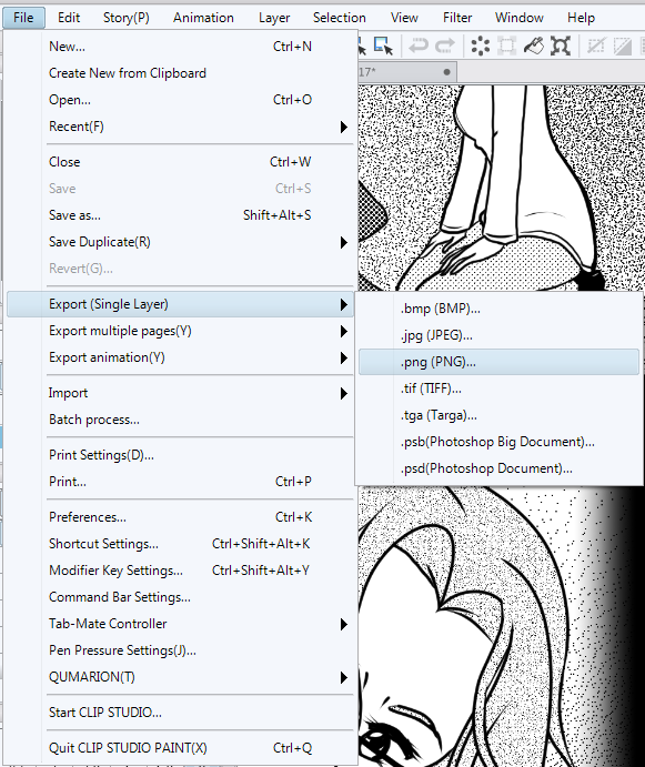
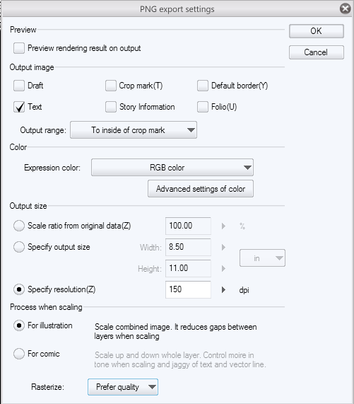
First and foremost: Export that page as a flat image, such as a PNG. Usually I export to the inside of the crop marks, at 150 DPI, as an illustration. I get a little more moire from my tones, but I kinda like the look. I also find that Clip Studio does some weird resizing of tones if you let it.
Once it’s been exported, I then load the page in Photoshop (though I could do this in GIMP or Paint.Net), and shrink it to 72 DPI.
I also take steps to compress it further using TinyPNG, as a small filesize does help considerably with load times (which can affect SEO), but… Well, that’s me. Once you have your page at web resolution, you’re usually in pretty good shape!
If any of that interested you, I’m pretty easy to find on the internet.
- Digital Artist Resources and Materials @ Shooting-stars.org
- My current comic project, Linked
Comments
Post a Comment