Watercolor Basics: Step by Step: Planning Your Watercolor Illustration
Now that we've introduced the basics of Watercolor Basics, it's time to take you step by step through some of the most common processes for completing a watercolor illustration. I'm going to take you from start to finish through my 2016 Christmas card illustration, explaining my techniques as I go. I have a series of video tutorials recorded concurrently that should be available on my Youtube channel soon, if you need some live action explanation.

If you enjoy this series, if you have learned something, or if I have inspired you in some way, please take a moment to share this, or any post, with your friends and familiy on your favorite social networking platform. There are handy sharing buttons below this post. If you enjoy art education content, and would like to be part of the process, please visit my Patreon for information on how to join the artnerd community. Backers get early access to popular series, backer exclusive content, and voting rights on upcoming content.

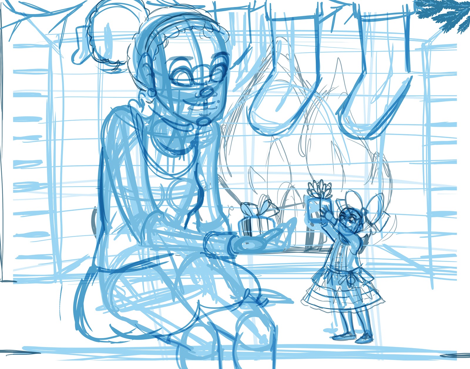
When we've finished working through the Step by Step tutorials, our finished image will look like this!
Planning for your upcoming illustration can be one of the most vital steps to the success of a watercolor. Having a good idea of what you want your finished illustration to look is one thing, but what's more important is how you want it to feel. For my Christmas Cards, I always want to convey warmth and happiness, so this was a feeling I wanted to carry into this year's card.
Things to consider when planning your illustration:
This year was the first year I could confidently introduce Naomi to my Christmas cards without it coming across as a spoiler, so I knew I wanted to include Naomi on this year's card. I've spent a lot of time planning, writing, and illustrating chapters for Volume 2 this year, and I wanted my card to be a reflection of that, as well as a reflection of Naomi and Kara's growing friendship.
Naomi's house is based on the house that my mother grew up in, and in the living room was a large brick fireplace that had been painted white. The brick beneath was a warm red and black, and I decided that for this illustration, I wanted to use that warm brick to help convey a feeling of warmth and security- something many of us long for this year.
So things I considered when planning this year's card:
Don't know what I'm talking about? Why not pick up a copy of 7" Kara Volume 1 for yourself? If you enjoy my art, then you should definitely check out my comic! Volume 1 features four chapters of lavish watercolor comic, a bonus story in ink and seafoam green, and a concept section that explains how I've created the world of 7" Kara.
Gameplan
Since I'd been working on digital art for my kidlit art portfolio, I'd started using Photoshop and Manga Studio more regularly. Although I'm not entirely comfortable drawing digitally (honestly, I hate how the stylus feels against a slick screen), I'd put in a lot of practice, and had gotten better, so I figured I could do my sketching and refinement digitally. Once I returned to Nashville, I could print my sketch as bluelines on some artist quality watercolor paper (Canson's Moulin du Roy in this instance), and probably finish the painting within three days, giving the cards time to ship to me, and giving me time to write and mail the cards before Christmas.
Sketching/Roughs
Digital (Photoshop)
Breaking up the picture plane to help plan composition

Initial sketch
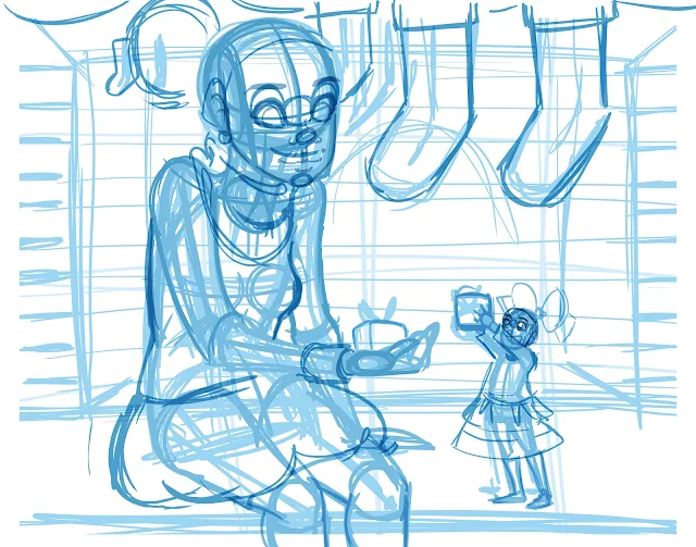
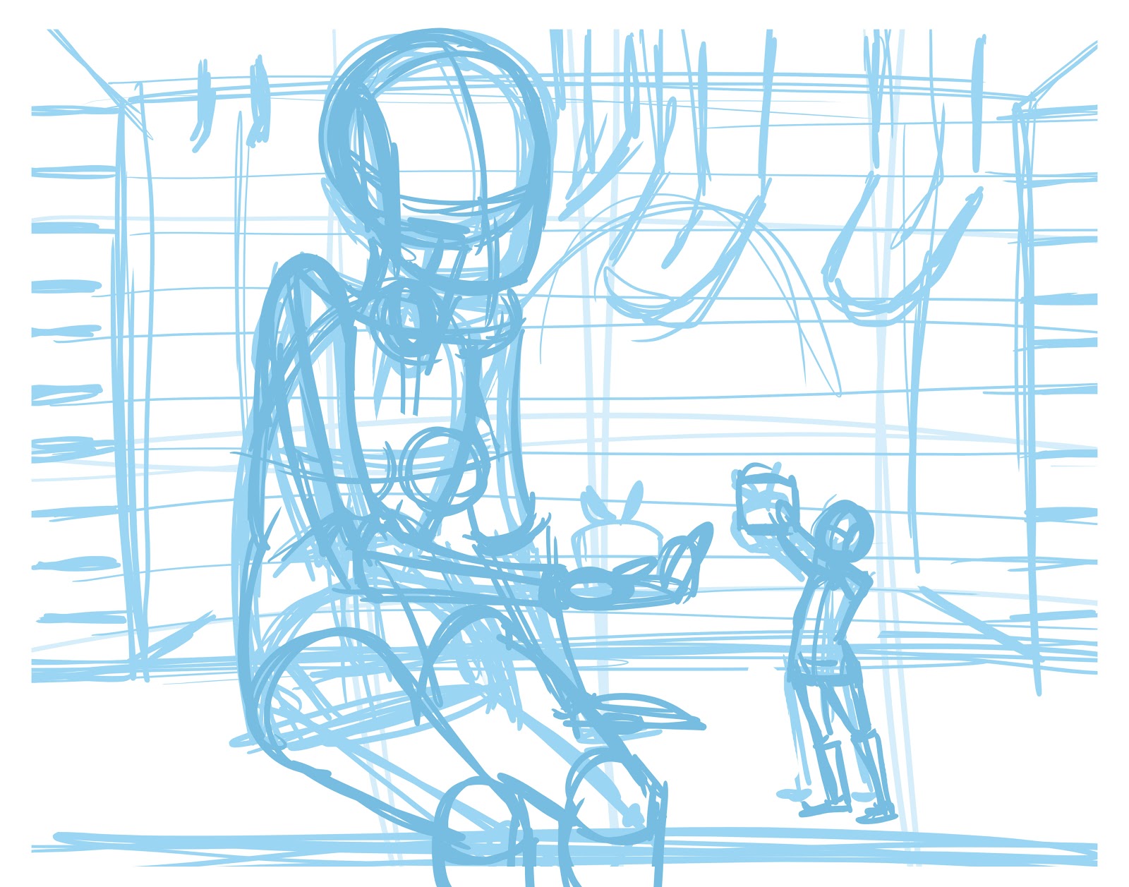
 From there, I can quickly sketch in wireform figures and a hasty background. At this point, I'm not really concerned too much about accuracy so much as I am conveying a feeling.
For illustration, sketching and refinement are an important part of the watercolor process. Depending on how tight you work, you may need to do more work and refinement at your sketching stages, so having your drawing fundamentals in place is really key. You are always encouraged to practice skills you wish to develop while learning other skills, so don't be discouraged if your drawing isn't up to snuff just yet.
Refining and blocking in figures

Further refinement of figures using constructive anatomy

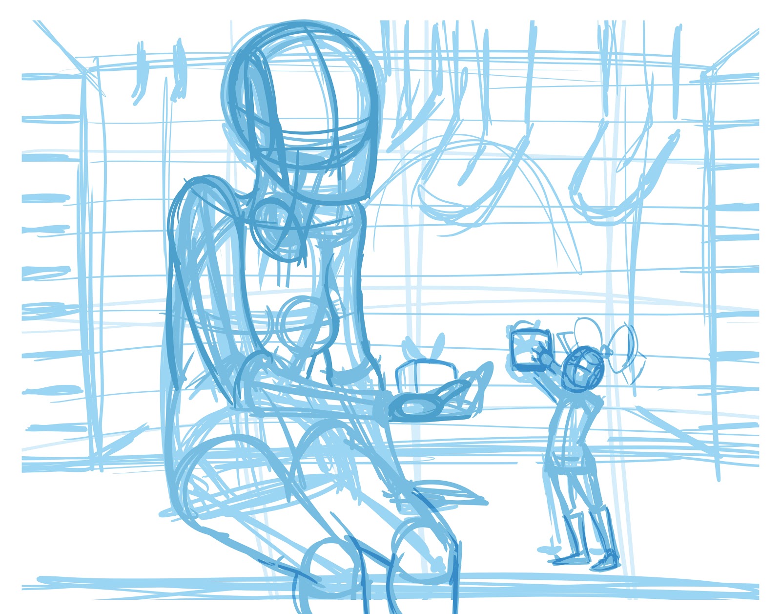
Sketching in clothes and breaking down the faces

Adding details to the face
Refinement of clothes and facial features. Blocking in more background elements
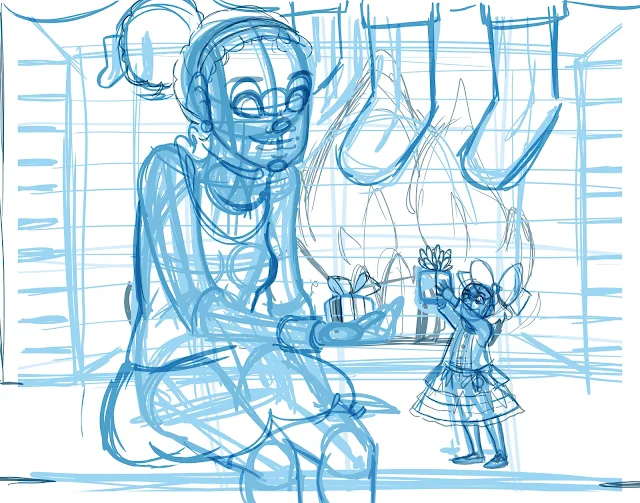
Further refinement of background elements

Refinement/Tight Roughs
Digital (Manga Studio)
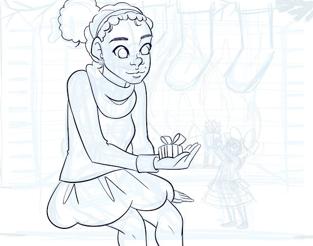
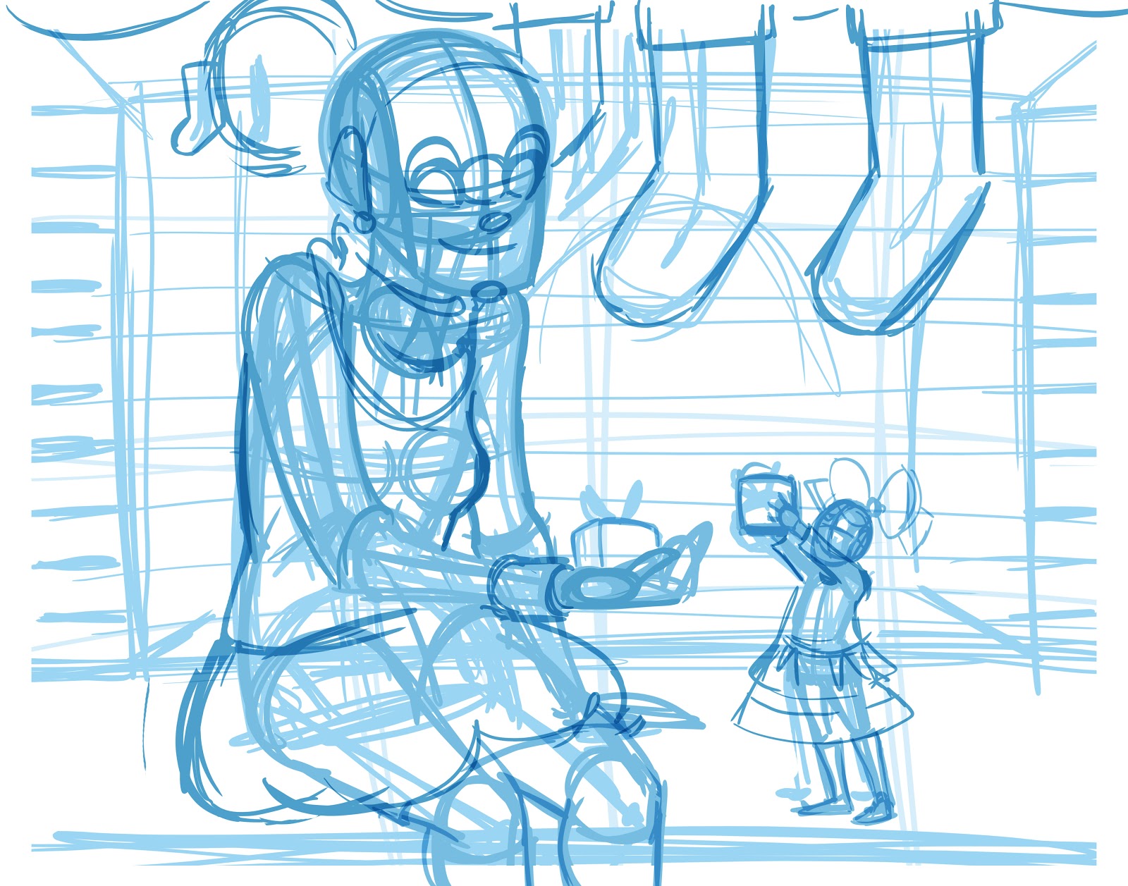
Refining faces first

Refining figure and clothing details
 Refining other figure
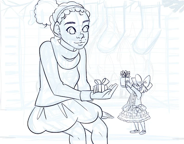
Inking in Background Details


For more beautiful watercolor work, why not pick up a copy of 7" Kara, Volume 1? 7" Kara is a lush watercolor comic the entire family can enjoy, following the adventures of tiny Kara as she discovers humans, explores the backyard, and befriends a kitten. Created by Becca Hillburn, if you enjoy this blog and my art, you'll love 7" Kara. Volume 1 is available in the Natto-shop.

If you enjoy this series, if you have learned something, or if I have inspired you in some way, please take a moment to share this, or any post, with your friends and familiy on your favorite social networking platform. There are handy sharing buttons below this post. If you enjoy art education content, and would like to be part of the process, please visit my Patreon for information on how to join the artnerd community. Backers get early access to popular series, backer exclusive content, and voting rights on upcoming content.

When we've finished working through the Step by Step tutorials, our finished image will look like this!
Planning for your upcoming illustration can be one of the most vital steps to the success of a watercolor. Having a good idea of what you want your finished illustration to look is one thing, but what's more important is how you want it to feel. For my Christmas Cards, I always want to convey warmth and happiness, so this was a feeling I wanted to carry into this year's card.
Things to consider when planning your illustration:
- Timeframe
- Materials you wish to use
- End use
- Subject matter
- Mood
This year was the first year I could confidently introduce Naomi to my Christmas cards without it coming across as a spoiler, so I knew I wanted to include Naomi on this year's card. I've spent a lot of time planning, writing, and illustrating chapters for Volume 2 this year, and I wanted my card to be a reflection of that, as well as a reflection of Naomi and Kara's growing friendship.
Naomi's house is based on the house that my mother grew up in, and in the living room was a large brick fireplace that had been painted white. The brick beneath was a warm red and black, and I decided that for this illustration, I wanted to use that warm brick to help convey a feeling of warmth and security- something many of us long for this year.
So things I considered when planning this year's card:
- I wanted to create a nice holiday card to send to Patreon backers, close friends, and family
- I wanted the card to feature something I care about- the characters from my comic, 7" Kara (subject matter)
- I wanted both Kara and Naomi doing something cute (subject matter)
- I wanted to include a fireplace (mood, subject matter)
- I wanted a warm feeling (mood)
- The composition would have to allow for both characters to be clearly visible
- I was in Luling, and had no real way to work on a sketch/refinement physically, so I needed to start digitally (materials)
- I am not entirely comfortable drawing everything digitally (materials)
- This image needed to be ready to paint as soon as I returned to Nashville, as I had a very small window of time to work with (timeframe)
- I wanted to work horizontally, and needed to work within a 7"x5" ratio (the size of the finished card) (end use)
Don't know what I'm talking about? Why not pick up a copy of 7" Kara Volume 1 for yourself? If you enjoy my art, then you should definitely check out my comic! Volume 1 features four chapters of lavish watercolor comic, a bonus story in ink and seafoam green, and a concept section that explains how I've created the world of 7" Kara.
Gameplan
Since I'd been working on digital art for my kidlit art portfolio, I'd started using Photoshop and Manga Studio more regularly. Although I'm not entirely comfortable drawing digitally (honestly, I hate how the stylus feels against a slick screen), I'd put in a lot of practice, and had gotten better, so I figured I could do my sketching and refinement digitally. Once I returned to Nashville, I could print my sketch as bluelines on some artist quality watercolor paper (Canson's Moulin du Roy in this instance), and probably finish the painting within three days, giving the cards time to ship to me, and giving me time to write and mail the cards before Christmas.
Sketching/Roughs
Digital (Photoshop)
Breaking up the picture plane to help plan composition

Composition is one of my weakest points, so I usually throw up a grid like the one above, dividing the image in half, then dividing the image into thirds vertically and horizontally.

For illustration, sketching and refinement are an important part of the watercolor process. Depending on how tight you work, you may need to do more work and refinement at your sketching stages, so having your drawing fundamentals in place is really key. You are always encouraged to practice skills you wish to develop while learning other skills, so don't be discouraged if your drawing isn't up to snuff just yet.
Refining and blocking in figures
When I sketch, I start big and work small, start loose and work progressively tighter. I try not to be concerned with fine details or sketching in the faces at this point- I'm really trying to capture the whole scene.
It seems that every artist has a preferred method of constructing figures. Mine is a form of constructive anatomy- a combination of Glen Vilppu, Andrew Loomis, and Paul Hudson.
Once the figures have been blocked in and refined, I can start refining the head. At this point, I'm just breaking the face into separate regions- no fine detail has been added.

Once the face has been broken down into regions, I can start refining the features. This method is particularly helpful for accurately drawing the face from different views.

I try to refine everything at roughly the same pace (it makes corrections much easier), but it's fine if you leave the background rough while you work on the figures. Once the figures and their clothing have been solidified, I start focusing on adding detail to the background.
Not everything has to be completely filled in- some elements can be detailed at the Tight Roughs stage, or even when painting. Be honest with yourself and work to the level of completion YOU need-there's no shame in working looser or tighter.
Digital (Manga Studio)
Refining faces first
I have found that I ink better in Manga Studio EX 5 than I do in Photoshop (Manga Studio has line stabilization), so I imported my PSD into Manga Studio. I put all of my sketch layers into one folder, and reduced the opacity of that folder greatly. For 'inks', I used a dark blue.
As recommended in my inking tutorials, I begin with the faces first, as my hand is fresh and able to handle the detail without shaking, and work outward.


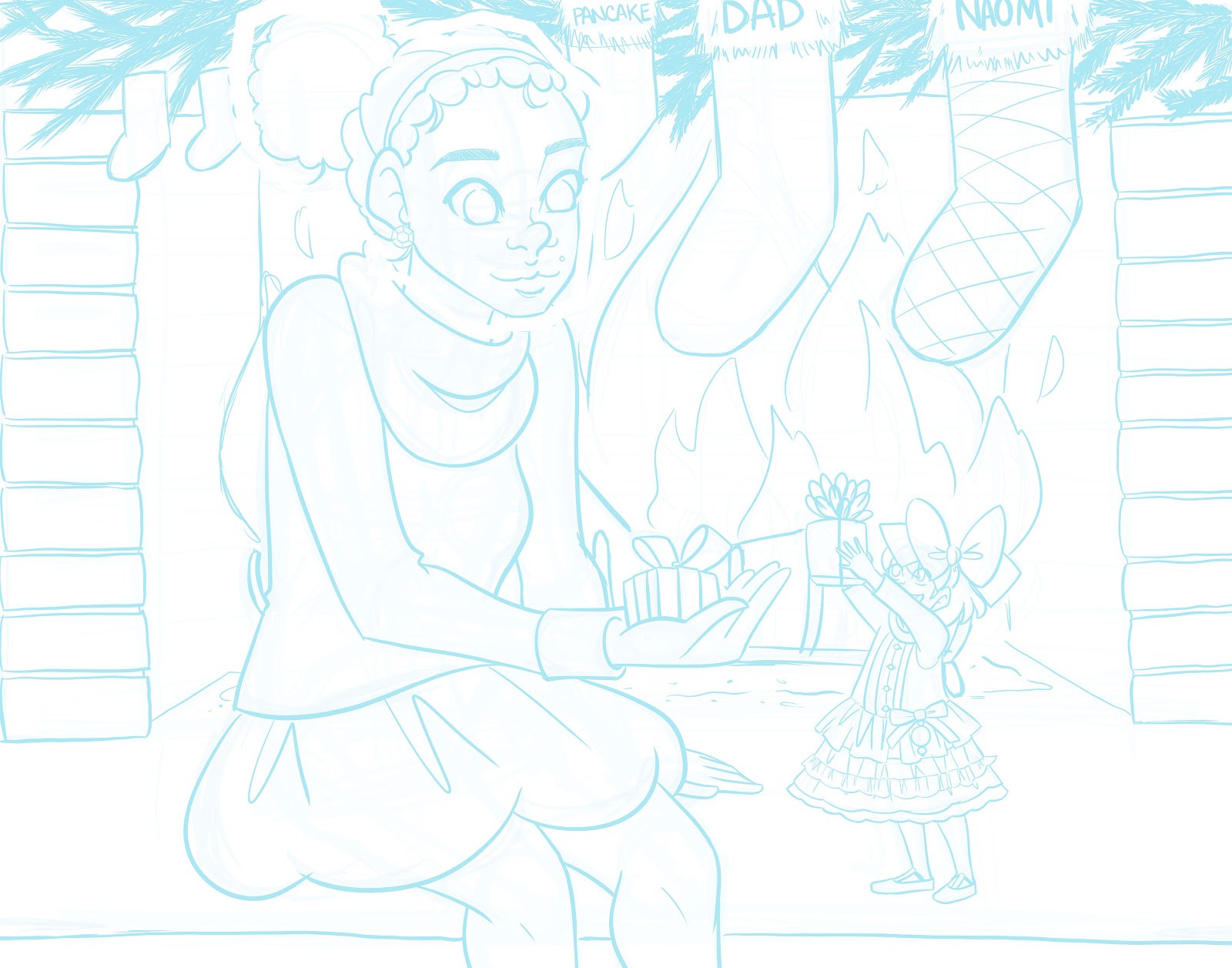
The next session, I inked Kara, from face to clothing.
Inking in Background Details

Once the figures have been inked, I move on to the background. Since details are looser in the background, and most of that can be handled in watercolor, I leave it fairly unrefined.
Editing Image
(Photoshop)

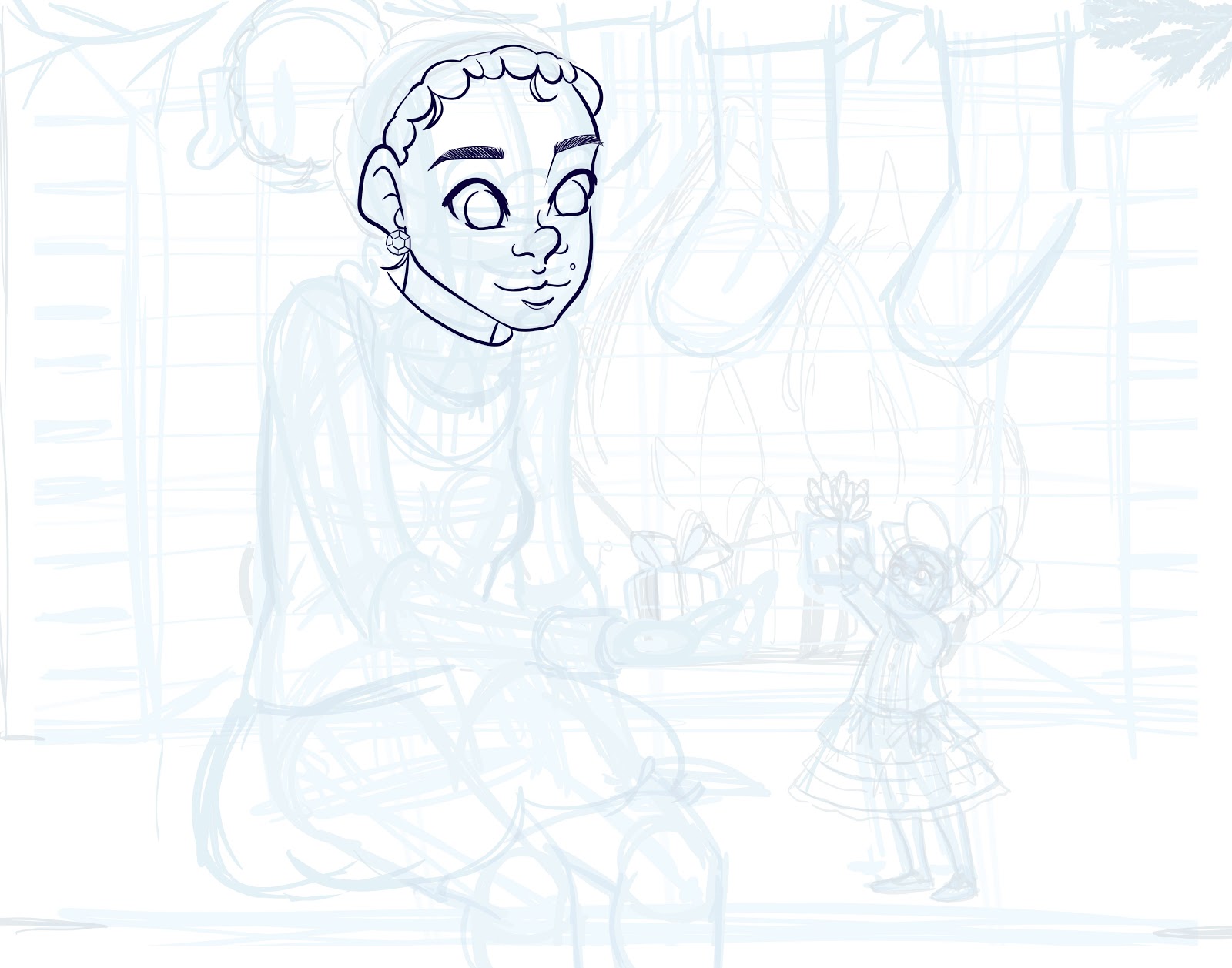
I open the image in Photoshop as I'm more familiar with it's basic editing tools. Naomi's head was too large in the Tight Rough, so I resized it.
Preparing for Print
For a tutorial on how to create digital bluelines, please check out this post.
Printing
I printed my bluelines on Canson's Moulin du Roy using a Canson Pixma Pro 9000 Inkjet printer. The ink used by this printer is water soluble, and will dissolve when I stretch my watercolor paper.
Coming Up Next: Step By Step: Stretching Your Paper
Our Sponsor

Comments
Post a Comment