Foiled Process Work
You guys have shown an interest in my process work, and I'm more than happy to share it with you guys! I love seeing how other artists work, and the only reason I haven't shared more of my process is because I was afraid it would bore everyone.
I'm currently working on a 12 page promo comic to sell at cons called Foiled. I worked on the script and the characters last semester, and there's still a lot of work to do. This 12 page comic is part of a much larger webcomic, but I'm using these 12 pages for studio class credit and to submit to a heroes themed anthology.
With this comic, I changed my process. I usually do thumbs-pencils-inks, which is honestly kind of boring by inks stage. This time, I did thumbs-tight roughs to iron out perspective details, and then inks with some areas tightened up in pencil first. I find this process much more fulfilling and rewarding. I spent a long time hammering out the thumbnails, taking care to really push myself to be more dynamic and to choose more challenging panel layouts. I feel like I'm still fighting the influence of all the really crappy manga I read during my teenage years, and while the experience pushes me out of my comfort zone, I'm more excited about my work.
THUMBS:
 These thumbs are actually a lot tighter than I usually do thumbs, but I've found that tighter thumbs really work better for me. With quickly drawn thumbs, I tend to forget after a couple days what all the chickenscratch means, but with thumbs this tight, I can actually get feedback from other people. This is pretty useful. The notes in the margins are both things pointed out in critique and things I've noticed myself, items I want to change or things to remember as I progress though the pages.

For thumbs, its four to a 8.5"x11" page. The guidelines are printed out on regular ol' copier paper. Yes, I am so insecure that I even use bluelines here. You have no idea how many times I've had to rework some of those panels.

For the longest time, I was frustrated that my thumbs would be dynamic, but my roughs and pencils would be stiff. As I become more comfortable with perspective, I'm finding this to be less of a problem.
ROUGHS:

In this stage, the perspective grid comes in to play. I don't try to get all my perspective work done on one sheet of paper, instead, I'll tape paper around the panel and work from that. When I'm done laying out the panel, I remove the excess paper. The goal here is to get the perspective figured out, since thats the most tedious part of the process for me. Fortunately, my roughs are looking a lot more like the layouts in my thumbnails.
 The faces are still pretty simple at this stage, the goal is to get the gesture down, not the expression. There's still notations in the margins, though. For me, its always a work in progress.
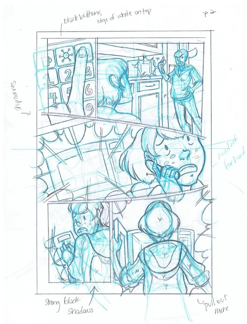
 I don't really bother establishing the black placement any further than marking with an X. If someone else were to ink this, it would be much tighter, and all the black placement would be filled in.


I'm currently working on a 12 page promo comic to sell at cons called Foiled. I worked on the script and the characters last semester, and there's still a lot of work to do. This 12 page comic is part of a much larger webcomic, but I'm using these 12 pages for studio class credit and to submit to a heroes themed anthology.
With this comic, I changed my process. I usually do thumbs-pencils-inks, which is honestly kind of boring by inks stage. This time, I did thumbs-tight roughs to iron out perspective details, and then inks with some areas tightened up in pencil first. I find this process much more fulfilling and rewarding. I spent a long time hammering out the thumbnails, taking care to really push myself to be more dynamic and to choose more challenging panel layouts. I feel like I'm still fighting the influence of all the really crappy manga I read during my teenage years, and while the experience pushes me out of my comfort zone, I'm more excited about my work.
THUMBS:


For thumbs, its four to a 8.5"x11" page. The guidelines are printed out on regular ol' copier paper. Yes, I am so insecure that I even use bluelines here. You have no idea how many times I've had to rework some of those panels.

For the longest time, I was frustrated that my thumbs would be dynamic, but my roughs and pencils would be stiff. As I become more comfortable with perspective, I'm finding this to be less of a problem.
ROUGHS:

In this stage, the perspective grid comes in to play. I don't try to get all my perspective work done on one sheet of paper, instead, I'll tape paper around the panel and work from that. When I'm done laying out the panel, I remove the excess paper. The goal here is to get the perspective figured out, since thats the most tedious part of the process for me. Fortunately, my roughs are looking a lot more like the layouts in my thumbnails.


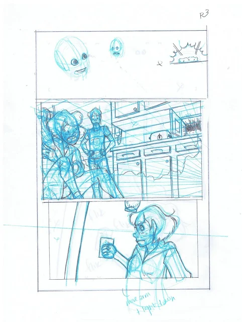
As the story develops and conflict begins to crop up, I begin focusing more on the faces and bodylanguage and less on the background, especially since I've established the setting already.


After this step, I scan all the pages, crop them, resize them to 10"x15", change it from RGB to Black and white, change that to a Duotone setting that's cyan, print it on plate bristol, and begin pencilling/inking over that.
EXAMPLE OF PENCILS OVER THIS BLUELINE:

Sorry the bluelines are so faint, I can see them a bit better on the original. I haven't tweaked any of the scanner settings. As you can see, I don't bother to repencil the entire thing, because that's not necessary. I just pencil it enough to fill in the gaps. Although my scanner is large format, the quality isn't that great, so I prefer to scan at school using their overpriced but amazing scanner.
UNFINISHED INKS

These were scanned using my crappy scanner, so the quality isn't what it could be. No corrections have been made, and the text hasn't been added yet.

In the final version, the blacks will be MUCH darker, there will be no ghosting from the bluelines, and the text will be added. Generally, it will be much cleaner.
Comments
Post a Comment